Monday

Magazine name


  • Decide chosen magazine name and explain why
  • Write it in the 3 different fonts
  • Upload video of 10 people from target audience deciding which font they prefer and why
  • Analyze

Using the wordle I created and with a bit of thought, I have come to the conclusion that my magazine will be called
INTRO
This name has a double meaning. It can be the introduction to a song, or it can be the introduction of new music, which defines the focus and aim of my magazine. I'm proud of the name because although it doesn't sound like a typical music magazine, the reasoning behind it has a lot of thought. Also, the shortening of the word 'Introduction' should appeal to the younger part of my target audience because it's short and easy to say. The word itself is smooth, rolling off your tongue when you say it, and the 'o' sound is powerful and striking, making it memorable.

Target Audience
The target audience for my music magazine will be roughly people between the ages of 15 and 25. My reasons behind this include the results of my questionnaire, when the majority of people to responded were in their late teens, and teaming this with my knowledge of teens being very up to date with new music, I decided this was the right age to aim my magazine at. Also, the fact that I wanted to include some explicit language meant that I couldn't target people of any younger age than 15 because it would be inappropriate. I expect my target audience to be a range of genders and ethnicity who have a range of different interests and hobbies. However, I expect them to be well educated so the slightly more complex language will not be a problem to understand.

Wordle

The wordle below is made up of the words which sprung to mind when I thought of new music and music magazines. I will use the wordle for inspiration when I am deciding on the name of my music magazine.

InDesign plan

Front page

Contents page

Double page spread


Question 10

This question made me consider my own influence on my magazine more - I began to question whether to change my plans to coincide with the responses to my survey, or whether to stick to my plan because I made it with the analysis of my own research. The outstanding response was 72% of the respondents choosing sans serif font as their favourite to read on a music magazine. If I was to ask this question again, I'd add a written answer box so I could discover why this is their favourite. Personally, I prefer serif fonts, but this question has helped me to strike the right balance between the two so it appeals to my target audience.
Question 9
This question was one which the respondents could give more than one answer to. 25 people said that they like finding out about an artist's personal life - so I assume this is their life away from their career including things such as family and partners. It surprised me that only 7 people said that they had an interest in an artist's future career because I thought that this was something which fans wanted to find out before anyone else, and this is the sort of theme which my magazine promotes. The second top answer is musical influences, though I hadn't considered this to be something which people took an interest in - I will now have to incorporate this into my article. I will look back on this question when I come to writing my article and have a look at answers belonging to individuals so I can analyse my target audience's views more closely.
Question 8
As I expected, the most popular response was simple language - which I will definitely use because it clearly appeals to a wide audience, and will be important especially as my target audience can be as young as mid-teens who may not understand language which is too complex. Just slightly more than the number of people who voted for complex language, 17 people voted for explicit language. Although this was part of my original plan, analysing this survey and looking at the ages of the people who have filled it in has led me to change my mind. I have decided to now use mostly simple language, with as few complex words as I can, and no explicit language whatsoever - I just hope this doesn't effect the humorous aspect of my article and its appeal to an older audience.
Question 7

The aim of this question was to help my final decision of the colour scheme for my magazine. The top result was blue, with an outstanding 14 of the respondents choosing it as their favourite colour. However, I have decided not to use this colour because I think it can be stereotyped as more appealing to males rather than females, and it would be wrong to use it if this was what would define the kind of audience which I am aiming my magazine at. The second top rated colour was red with 10 of the votes, and again, I am deciding not to use this colour because it is the main colour used in Q magazine, and I don't want Q to influence my music magazine too much. Instead of using the third most popular colour (pink) I have decided, along with the influence of my front cover photos, to combine the two most popular colours and use purple as my main colour.
Question 6
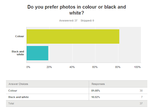
I didn't expect an outstanding response to this question, so it was interesting to find out how many of my respondents preferred colour photos. This outcome fits well with my plan, though, because  only plan on using a black and white photo for my double page spread, so the majority of my photos will be colour to keep them eye catching. Although I don't agree with the majority of the respondents, I am not going to change my plan and base it on this survey because then my magazine will lose its purpose and that is to follow the codes and conventions of a music magazine.
Question 5
I was surprised to find that 17 of the respondents preferred a mid shot on the front cover of a magazine, though this might be because I, personally, much prefer close ups. Out of the front covers I analysed, a mid shot only appeared once and that was on Mixmag, a dance genre magazine which made me think that this was the kind of genre which most people preferred, though this wasn't the result on question 3. As this was the most popular answer, I have decded to experiment with different angles for my photos, however, I am still drawn to my ideas of a close up, especially due to the positive feedback I got from this survey. I had a feeling that a low angle photo wouldn't be very popular because I know it isn't a very attractive angle and it can be quite intimidating, so it didn't surprise me to see that only 1 person preferred it. This is also the case for the long shot, 12 people voted this as their favourite type of photo, though it contradicts a lot of the feedback from question 3 which revealed that people like close ups because they feel "closer to the artist". Though I will be experimenting with photos in the studio, I doubt I will use any too extreme (such as a low angle) because these tend to be unconventional, especially for an Indie magazine, as well as being my least favourite type of photo. As for a high angle photo (which I've been thinking of using), I will try and achieve this but I am having doubts as to whether it will look as good as I've imagined it to.